Overview
A home-built marketing-automation platform used to design, target, and ship personalized email and messaging campaigns to millions of customers. I led the end-to-end redesign — every section, every flow, the design system, and the AI capabilities layered on top.
Context
The platform handles the entire campaign lifecycle in one place — building audiences, authoring messages, scheduling and approving campaigns, and measuring results. But the capabilities had accumulated faster than the interface could hold them. Power users were productive; everyone else faced a steep, unforgiving learning curve.
Problem
The platform could do almost anything — which was exactly the problem. Depth without structure meant every task felt like expert work. Features lived in inconsistent patterns, navigation didn't scale, and a single campaign could send someone across the product a dozen times with no clear sense of where they were in the journey.
Key issues included
- •Six compounding problems, from a fragmented interface to documentation nobody could keep current
- •Every one of them made the next feature more expensive to ship
- •Detailed below
Solution
I organized the product around the campaign lifecycle. Each module maps to a real stage, so the platform reads as a sequence, not a pile of tools. Then I rebuilt each module's core task end to end, extracted a design system so every screen speaks one language, and introduced AI where it removes real friction — with human control over anything customer-facing.
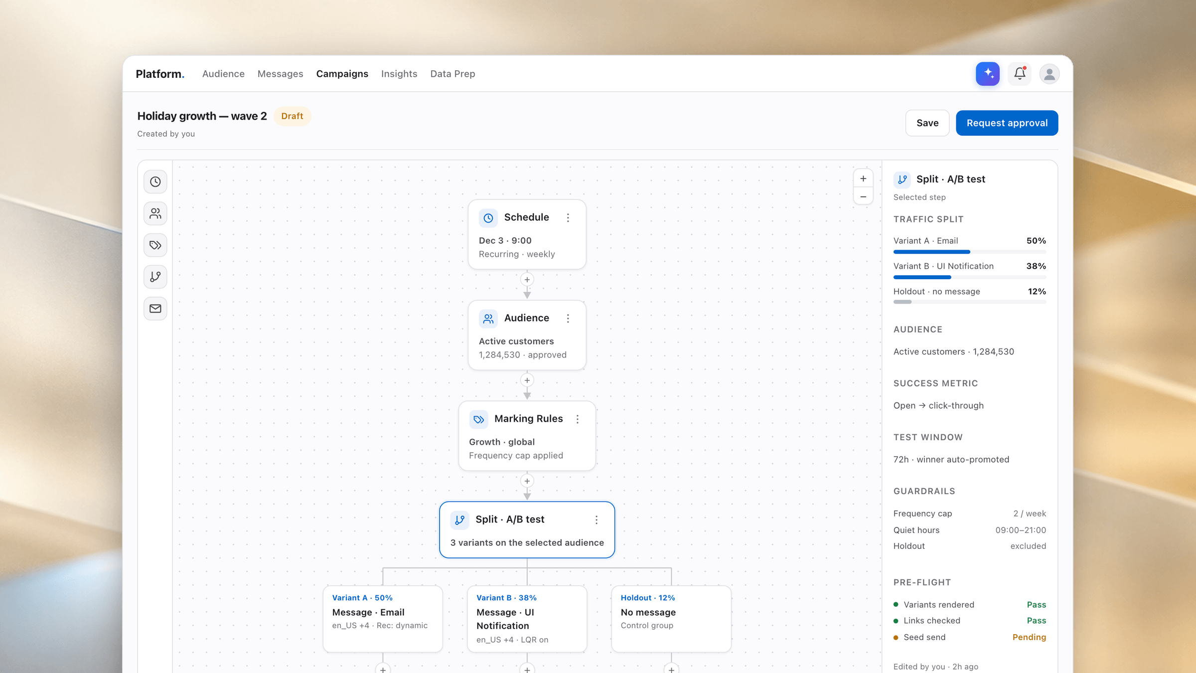
I can talk about this work, but I can't show the real interface. Every visual on this page is a schematic reconstruction I drew for this portfolio — the structure, flows, and decisions are real; the pixels are not the production UI.
The product itself is a conventional email marketing platform, close in kind to HubSpot: build an audience, author a message, schedule and approve a campaign, measure the result.
The Challenge
Deep functionality, shallow usability.
The platform could do almost anything — which was exactly the problem. Depth without structure meant every task felt like expert work.
No shared language
Each area had grown independently. The same action looked and behaved differently depending on where you were, so nothing you learned in one module transferred to the next.
Didn't scale
The original navigation couldn't hold a growing feature set. Finding the right screen — and knowing where you were in a multi-step campaign — took insider knowledge.
Expert-only workflows
Writing audience queries, segmenting, wiring approvals, reading analytics — each was powerful but exposed raw, with little guidance for anyone who wasn't already an expert.
High cost of error
Campaigns reach real customers at scale. The UI had to make consequential actions feel deliberate and reversible, and surface approvals clearly — without slowing experts down.
Design debt
Years of incremental additions left mismatched components, spacing, and states. There was no source of truth to build against or scale from.
Docs always stale
The product shipped faster than anyone could document it. New capabilities landed undocumented, so users couldn't discover what the platform could already do.
Redesign · The transformation
From code-heavy tool to intelligent platform.
The platform began as an engineering tool: messages written by hand, audiences queried by hand. Each move widened who could actually use it.
A code-heavy email generator
At first it was a bare tool for building and blasting emails. It was powerful — but every send meant hand-writing the message and hand-querying the audience. Using it required real engineering skills, so it stayed locked to a handful of specialists.
HTMLCSSJavaScriptSQLA guided interface. The engineering utility became a product people could use without writing code.
New modules and a canvas. Campaigns became a visual canvas of connected nodes instead of a long form.
AI, built in. Assistive and generative help plus one alert centre, so the platform helps do the work.
Research · Who I designed for
Four people, one platform.
One campaign passes through very different hands. The redesign had to serve all four without collapsing into a lowest-common-denominator tool.
The campaign builder
Goal: Ship a personalized campaign fast. Pain: Lived in expert-only screens and raw queries. What changed: Guided creation, live previews, AI assistance.
The campaign operator
Goal: Watch sends go out cleanly, catch problems live. Pain: Run-time status buried inside strategic analytics. What changed: A dedicated dashboard focused on live health.
The approver
Goal: Sign off with confidence on something irreversible. Pain: Unclear what was actually about to send. What changed: Explicit approval flow with a simulation of who gets what.
The data analyst
Goal: Get data in, read results out. Pain: Data prep and analytics felt disconnected. What changed: Both designed as first-class stages of one lifecycle.
Redesign · Information Architecture
Structure that mirrors the work.
The redesigned structure: five sequential stages, with Settings and Survey as supporting modules that plug into every stage.
Get the data in
“I load and shape the data I need from our sources so it's ready to target.”
Choose who
“I define exactly which customers to reach — and preview the reach before I commit.”
Craft the message
“I author and personalize the message per channel, then send myself a test.”
Schedule & approve
“I schedule, split, simulate, and route it — then get a second pair of eyes to sign off.”
See what worked
“I measure engagement, conversion, and revenue — and learn for the next wave.”
Redesign · Before / After
The same task, rebuilt.
The platform's most-used and most intimidating task, before and after the redesign. Same capability, different experience.
- ✕Dense sidebar mixing every tool; no sense of a workflow
- ✕Raw query only — no guidance, no plain-language path
- ✕Exposed IDs, no reach estimate, no privacy masking
- ✕Toolbar of ambiguous actions; validate & run disconnected
- ✓Top-nav mirrors the campaign lifecycle, not the org chart
- ✓Plain-language path via AI, with the query still inspectable
- ✓Masked IDs + live reach estimate before committing
- ✓Run, validate, and preview unified in one clear panel
Redesign · Section Highlights
Designing each module from scratch.
Seven modules, each rebuilt around the job it does: get the data in, choose who, craft the message, schedule and approve, then see what worked.
Craft · States & Localization
The screens between the happy path.
Enterprise tools live in their empty, loading, and error states as much as their ideal one. Designing those deliberately is where trust is won or lost.
Empty
Turns a dead end into a first step, with a low-effort AI on-ramp.
Loading
Skeletons that match the real layout, so nothing jumps when data lands.
Error
Specific, located, recoverable — it points at the exact token and offers a fix.
AI · In the product
AI that removes friction — not a chatbot bolted on.
I introduced AI where the platform's complexity hit users hardest: turning intent into audiences and messages, and turning dense results into plain-language answers.
From intent to query
Describe the audience you want in plain language and get a starting query you can inspect and refine — lowering the query barrier without hiding what's actually running.
Drafting & variants
Assisted message drafting and variant generation to accelerate authoring and A/B testing — always previewed, always editable before a test send.
Results in plain language
Summaries that turn a dashboard full of metrics into a readable answer, so insight isn't gated behind knowing which chart to read.
Human in the loop
AI drafts, people approve. Nothing customer-facing ships without explicit human confirmation.
Transparent, not magic
The generated query and the draft stay visible, inspectable, and editable.
Right where the work is
AI lives inside the task, not in a separate mode you have to switch to.
Fail safe
Suggestions default to reversible, low-risk states. The destructive path is never the easy one.
AI · Beyond the product
An AI agent that keeps the platform documented.
The product shipped faster than anyone could document it, so I designed an agent that turns shipped work into review-ready documentation.
- ✓Checks ticket status and picks up shipped work
- ✓Drafts and updates the relevant doc pages
- ✓Curates a human-readable release log (shipped-only)
- ✓Enforces terminology, style, and structure rules
- ✓Flags screens that need fresh screenshots for a human
- ✓Opens changes for review before anything publishes
Foundations
One system, seven modules.
To redesign this much surface area and keep it coherent, I built a component-based design system — shared patterns for tables, forms, creation flows, previews, approvals, and empty states.
New features now inherit good defaults instead of reinventing them, which is also what makes the interface ready to absorb AI and system feedback without fragmenting again.
Depth kept.
Learning curve flattened.
The redesign kept everything power users relied on while making the platform legible to everyone else — and set it up to grow with AI instead of against it.
Structure beats polish
The biggest usability wins came from fixing the information architecture, not restyling screens. Get the map right and the rest follows.
Systems make breadth possible
Owning seven modules alone was only feasible because a design system turned one-off decisions into reusable patterns.
AI needs design most
The value of AI in a serious tool comes from restraint — clear affordances, transparency, and human control — far more than from raw capability.
Approach
- •Understand the domain — sat with marketers, campaign operators, data engineers, and approvers to map how a real campaign gets built, and where it stalls
- •Restructure the information architecture — reorganized the product around the campaign lifecycle rather than the org chart that built it
- •Design the flows — rebuilt each module's core task end to end, reducing steps and making state visible at every point
- •Build a design system — component library and interaction patterns, so new features inherit good defaults instead of reinventing them
- •Introduce AI, deliberately — assistive and generative AI where it removes real friction, with clear affordances, previews, and human control
- •Keep it documented — designed and shipped an AI agent that reads the ticket tracker and keeps documentation accurate release over release
Impact
- •Campaign creation shifted from expert-only to a guided, repeatable flow
- •New users onboard through guided flows and AI instead of tribal knowledge
- •One consistent design language across 7 modules
- •AI adopted inside real workflows, safely
- •Documentation that finally keeps pace with releases
Reflection
"Three things stuck with me from owning this much surface area alone."

